01 — The Overview
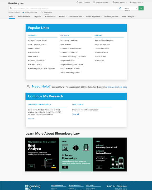
Bloomberg Law's homepage hadn't been touched in nearly a decade.
The original experience was a dense, utility-first page built for power users who already knew what they were looking for. As Bloomberg Law grew its product suite — adding intelligence centers, AI-powered tools, and personalized research workflows — the homepage stopped functioning as an entry point and became an obstacle.
A contractor was brought in to design a new iteration. The design failed to engage users in testing — feedback cited too much white space and components that felt visually heavy and dark. The contractor left before completing a second iteration, and I was pulled in to take it across the finish line.
My Scope
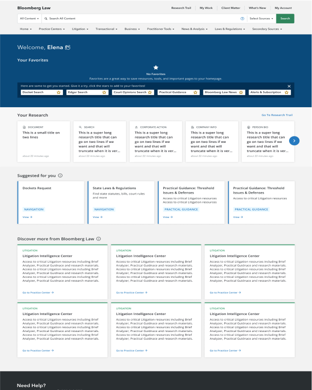
The product team had already committed to a set of homepage sections and the components that would support them. My scope was not to redesign the information architecture from scratch — it was to redesign the visual language of a system already in motion, and to advocate where I could. The four locked sections were: Your Favorites, Recommended for You, Top Picks from Your Practice Areas, and Pick Up Where You Left Off.
02 — The Constraints
Designing under constraints
The information architecture was locked. The sections were decided. My job was to make the visual language work within those constraints and deliver something that felt intentional, not inherited.
Strategic Call
The PM initially proposed user testing the homepage design. I wrote the usability test and concluded that given the visual constraints, there wasn't much actionable insight we'd gain from it. The PM agreed and we redirected the research budget toward more complex workflow validation where it would have greater impact.
03 — Design Decisions
Four macro visual design decisions
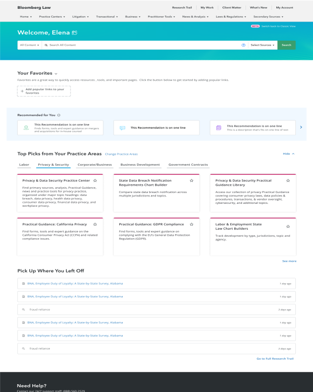
Decoupled the search bar from navigation
The original design embedded Bloomberg Law's Go bar inside an already crowded navigation. The contractor's iteration kept it there. The redesign moved search below the masthead, giving it full-width prominence as the primary action on the page. There was stakeholder pushback, but the rationale held: either simplify the nav, or decouple it from search entirely.
Differentiated card sections without visual chaos
The challenge was making four consecutive card sections feel distinct without the page looking choppy. Each section got a different card treatment: Recommended for You used a blue highlight carousel; Practice Areas used tabbed navigation with accent-colored cards per group; Pick Up Where You Left Off used full-width spanning rows, inspired by how Google designed their browser history — familiar, scannable, and visually differentiated from the denser sections above.
Strict grid alignment across all sections
With four visually distinct card sections, the risk was a page that felt fragmented. Every card placement was designed to snap to the grid. The consistency of alignment is what holds the page together despite the variation in card style. This was a deliberate decision to create coherence through structure rather than visual sameness.
Shifted the homepage from utility to identity
The original page greeted every user with the same generic "Popular Links" panel. The redesign opens with a personalized welcome, the user's name, and content surfaced from their own research history and practice areas. This was the business goal — increase discoverability of Bloomberg's intelligence centers — but the execution required making users feel the page belonged to them before asking them to explore.